The Gentoo.org Redesign, Part 3
The New Main Pages
The site so far
So far, www.gentoo.org is showing marked improvement. In the last article, I designed a new documentation system using XML and XSLT, so all our site documentation is looking great and is serving the needs of our visitors. However, the look of the site as a whole hasn't changed; that's because I haven't really touched the HTML that users see when they initially visit our site. Our main page still looks the same as it did before.
Well, it's time for that to change. As I mentioned in the first article, our main page is getting too congested and we have no room for expansion. As you can see, I've packed quite a bit of content into the page.
I can't continue piling important links and paragraphs onto the main page -- there isn't any room! Fortunately for us, real estate on the Web is absolutely free.
So, to solve this problem, I'll split our single main page (index.html) into several subject-specific category pages (index-about.html, index-download.html, etc.) and create a menu system that will allow the user to easily move from one category page to another. The default page that loads when a user visits http://www.gentoo.org will be the "About Gentoo Linux" category page. This is an excellent choice because it provides general information about the project that will be of interest to first-time visitors.
Site goals
Now, I'm going to outline the goals of this new "category page" system, as well as some general design goals that you can apply to your own projects. Then, we'll take a look at how the category page redesign meets these goals.
Modularity
The new category page system needs to be modular. What does this mean, exactly? Well, at the moment I have "About Gentoo Linux" and "Download/Install" categories in mind, but in the future I may need to add "About the Team" or "Support" categories as well. Having the ability to easily add new categories in the future requires that accommodations be put in place during the design stage. I'll have to make sure that there's room for additional category links on my navigation menu, and that the layout of the page is general-purpose enough so that it can be used to present many different kinds of information. Then, adding new categories will be relatively easy and I'll be able to avoid completely redesigning the site, if in a few months I once again find that things don't fit.
There is a very important second step to modular design -- the use of XML and XSLT to separate presentation from content. If you've read part 2 of this series, then you're at least familiar with this type of design. Once I have the proper XSL template created, I can generate as many category pages as I like by simply providing the proper XML. And unlike the HTML, my XML will contain no display-related information; it's pure content. We'll take a look at the XML/XSLT implementation of the category pages in the fourth and final installment in this series.
General style guidelines
It's also very important that the new category layout be visually appealing. Remember, when a user types in http://www.gentoo.org, the "About Gentoo Linux" category page will appear first, so I want this to be an attractive page. Now, the word "attractive" means different things to different people, but this article presents a few good general guidelines that I am using during the design of the new category page that should apply to almost any Web site.
That boxy look
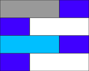
For general page layout, simple is best. If you're going to organize a bunch of complicated information, why not use a master table to split the page into various regions? This will also help to ensure that various parts of the page line up, which makes for a clean, attractive design. For example, this particular type of page layout is generally not very appealing:
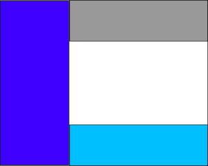
However, if the same information is presented using a common master grid, the site starts looking a lot cleaner:
And remember, the simpler your layout, the more information you'll be able to pack into the page without annoying your visitors
Text and background color
Next, we come to color choice. I have to admit that I happen to find bright green text on a dark blue background very appealing. But let's face it -- no matter how exotic and nifty they may look, dark backgrounds are a poor choice for text regions on a Web site. People expect to see dark text on a light background, and I for one think we should give them what they want.
Well, I should clarify my position. Using light text on a dark background is a horrible choice for presenting paragraphs of information, but can be quite attractive and functional for your menu bar, or a small list of links. In other words, inverted text can be a great accent, but go with a traditional color scheme for your main text content areas; you'll thank me later. This will also help to ensure that your site looks good on paper.
Contrast
Besides the dark text/light background issue, there aren't many hard rules when it comes to Web site design. If you like dark colors, it's perfectly fine to make the top part of the page dark blue, for example. Now, hear me correctly: If you make the entire page dark blue, you've done a bad thing. If you make a portion of the page (preferably a portion of the page that doesn't have much text in it) dark blue, you might actually be doing a very good thing, because that dark blue will contrast nicely with your white text area and add some additional drama to your new site. In fact, a large portion of your page can contain saturated or dark colors; again, just make sure that your main text content is presented in a traditional fashion.
Functional layout
I also want to ensure that the Web page is neither too cluttered nor too sparse. I suppose that all of us struggle with this challenge; some of us have a tendency to pack so much information into a page that it becomes totally unintelligible, while others include so many large margins and useless empty spaces that users are forced to scroll down several pages to find the information they need. For the new category pages, I want to use minimal margins -- just enough to keep things readable would be good, I figure. I'll only use empty spaces on the page if things are truly getting too cluttered. After all, the whole purpose of these category pages is to solve a space problem, and it would be good to concentrate as much information into as small a space as possible, as long as readability isn't compromised in the process.
A high information density has another advantage: Users are less likely to need to scroll down to find the information they need. This makes the page significantly more pleasant to use. (If you don't believe me, design a couple of mock-up pages and see for yourself.)
Content supercedes art
In working on the site layout, I have quickly learned that a Web page redesign should primarily be used as an opportunity to present content (actual information that's useful to my visitors) in a readable and meaningful way, rather than just another occasion to make an artistic statement or to exude large quantities of -- er -- corporate identity. Not that artistic statements are necessarily forbidden, but if by making one I hurt the presentation of my content, then I'm not doing my visitors a favor.
Once in a while, it's a good idea to step back and acknowledge that the people who are visiting our site are primarily looking for information rather than zany new approaches to Web design. If this is something you struggle with, be comforted: I, too, am tempted to focus on artsy stuff and leave all other priorities at the wayside.
The result
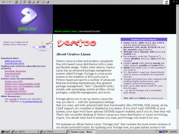
Now that we've covered some of my redesign goals, let's take a look at the new gentoo.org category pages. Here's the new page that you're greeted with when you visit http://www.gentoo.org:
I have to say that I'm really pleased with the redesign, and I really like the look of the new site. Notice how tables are used to break the page into four regions: the top left logo area, the black menu area, the gray infobar area, and the white main content area. Also notice that the clean alignment of these four regions makes the design simple yet attractive.
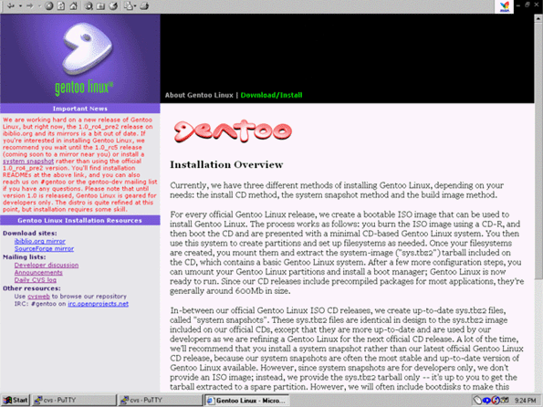
Now, look at the colors. As I mentioned earlier, I'm a big fan of extremely dark Web sites. However, because a very dark site is a bad thing, I reached a compromise: Dark parts were limited to the top regions, and inverted text was used only in the menu region, the logo and the title for the floating "Gentoo Linux Features" box. Because these parts of the page aren't used to present large quantities of text, I'm not going to annoy my visitors. Instead, they serve as nice accents to the main (white) text content area. Here's a snapshot of the "Download/Install" category page:
Another thing worth commenting on: You have probably noticed that the blue "flying saucer guy" and the red "gentoo" logo are from my original site. I decided to integrate these graphics into the new design so that the new main index.html page still looks familiar to my regular visitors. However, I omitted the "flying saucer guy" on every other page besides the main page so that more information could fit on the screen. The red "gentoo" logo was kept on every page because it helps to make the white content area more visually appealing and draws attention to the category title.
As you can see, the name of the current page is highlighted in bright green in the navigation menu, thanks to cascading style sheets (or CSS), and the current page name is repeated immediately below the red "gentoo" logo in the main content area. While I initially thought that this wasn't necessary, I found that simply highlighting the current page's navigation menu entry in green wasn't enough to provide users with an indication of what page they were on.
Despite the clean look of the new site, I am cramming quite a bit of information into the page. One advantage to this is that under most display resolutions, a visitor will only need to scroll down to finish reading the main text. However, all hyperlinks should be immediately visible and accessible, requiring no vertical scrolling by the user. This makes the site as a whole easier to navigate -- a big win for usability.
Lost in Xara
Just looking at the site doesn't really give you an idea of what the redesign process was like. I actually made a number of major logistical mistakes from the onset of the redesign. My greatest error was to immediately fire up Xara in an attempt to develop the new look for the category pages.
Once in Xara, I wasted a lot of time focusing almost exclusively on eye candy rather than on page layout. By doing so, I put the cart before the horse and ended up creating around 20 design prototypes that I eventually had to throw away. In the end, these prototypes were of no use to me because they did not deal with how to present the content.
Finally, I regained my senses, exited Xara, fired up a text editor, and wrotes the raw text that would appear on the page. Once the content was written, I developed a general page layout to present this text to the user -- no color schemes or eye candy just yet. Then, and only then, did I return to Xara and finalize the new look for the site, developing a color scheme and enhancing our logo. This time, the graphical design process went smoothly and relatively quickly because I had an existing framework (the text and layout) to direct my steps. Without this structure, I could have spent the rest of my life playing around in Xara, developing thousands of what-if design possibilities for the new site.
When you redesign your site, remember that content comes first, layout second, and graphical embellishments a distant third. By taking this approach, you'll end up saving yourself a lot of time.
User-centric IRC
So, I did make a few mistakes during the design process, but I also did a couple of things right, and one of them was to allow the Gentoo Linux developers to review and comment on my work as it progressed. As you may recall from my first article, my action plan identified developers as my highest-priority target audience, so getting our existing developers involved in the design was clearly a wise choice.
Doing this was easy. I just kept an IRC client running and connected to our IRC channel as I normally do, and then whenever I made any significant progress, I'd generate a .png snapshot of the current site and post it to our Web server. Then, everyone in the channel could take a look and comment on my work in real-time.
These developers acted as my barometer, letting me know what designs and colors were the most popular, and what types of layouts worked best. If the site design became too crowded or complicated, someone would let me know and I'd adjust the HTML accordingly. When the category page design became more finalized, I started creating tarballs of the site HTML/images so that developers could play with the code and make any necessary fixes. Thus, the IRC channel allowed the HTML to be developed in a truly user-centric way. Last, but not least, the Gentoo Linux developers really helped me to debug the HTML code so that it was rendered optimally in a variety of modern browsers.
Next time
Well, that's it for now. Join me in my next article when I finally convert the entire site to a fully-modular XML/XSLT-based system. That should provide some excitement as well as an opportunity to look at a lot of juicy behind-the-scenes XML development details!
Read the next article in this series: The Gentoo.org Redesign, Part 4
Browse all our available articles below. Use the search field to search for topics and keywords in real-time.


